
From Kickstarter to Best Buy
Being an early leader in wearables meant mountains of feedback from a fervent community of early adopters. We wanted to add a lot of functionality, rebrand visually, and rebuild onboarding to a much higher standard of usability. As the first UX designer at Pebble I led those efforts.
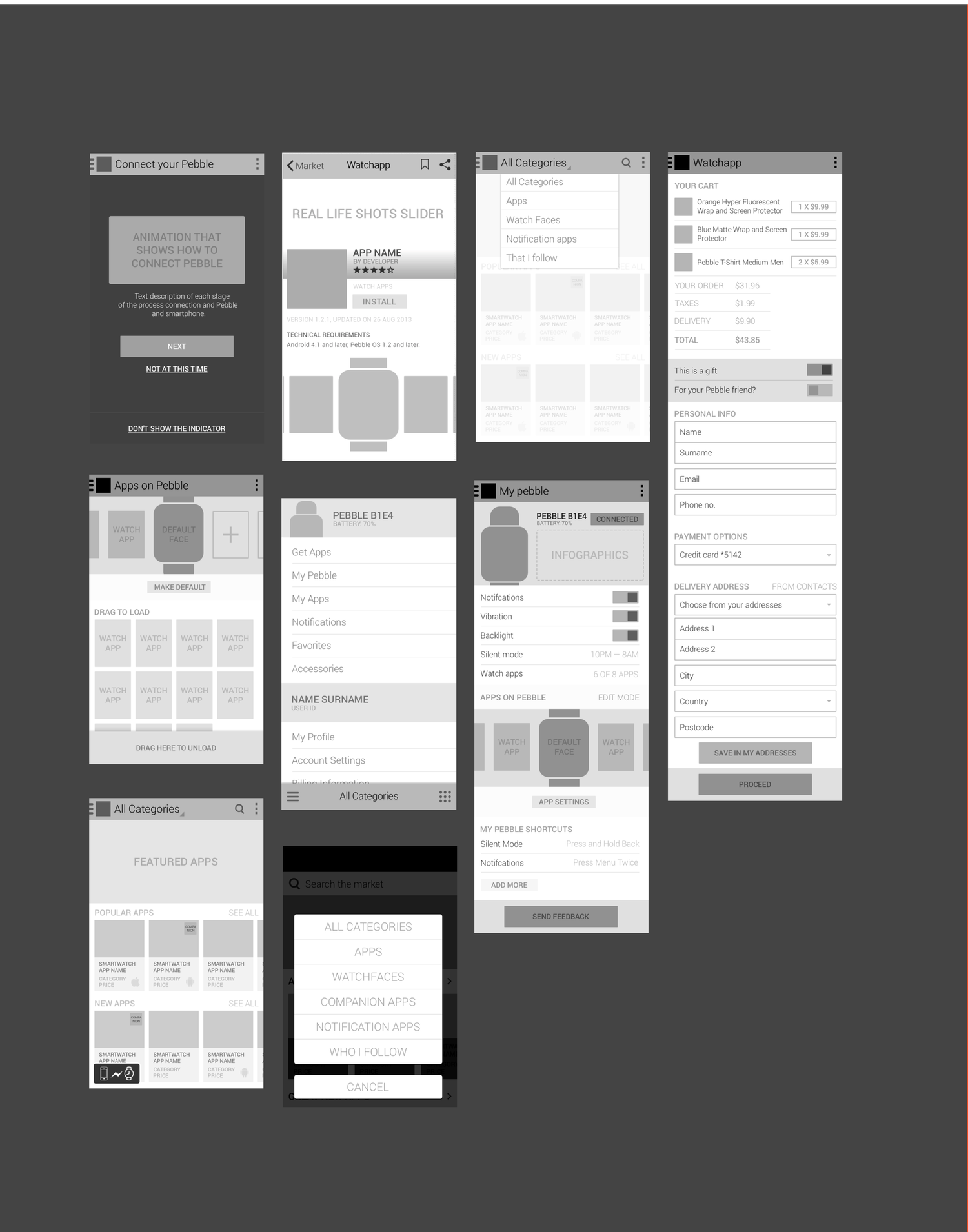
The companion mobile app had been designed entirely by engineers. We started over. First we sketched the screens we knew the experience needed, then worked out content and hierarchy, then interactions and the flows between screens, including moments like downloading an app onto your watch. iOS and Android were treated as separate but related projects.
The first version of the companion app had been designed entirely by engineers, so we started the redesign by sketching layouts of the screens we knew the experience needed.
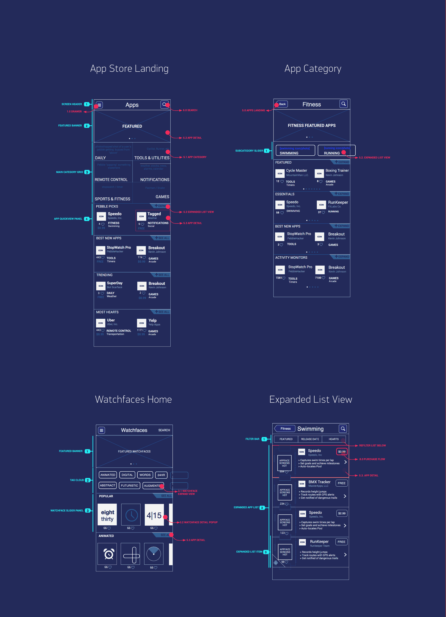
Once we were past the requirements conversations and knew how many screens we wanted, we took a more detailed pass at what each screen would contain, including the supporting navigational elements.
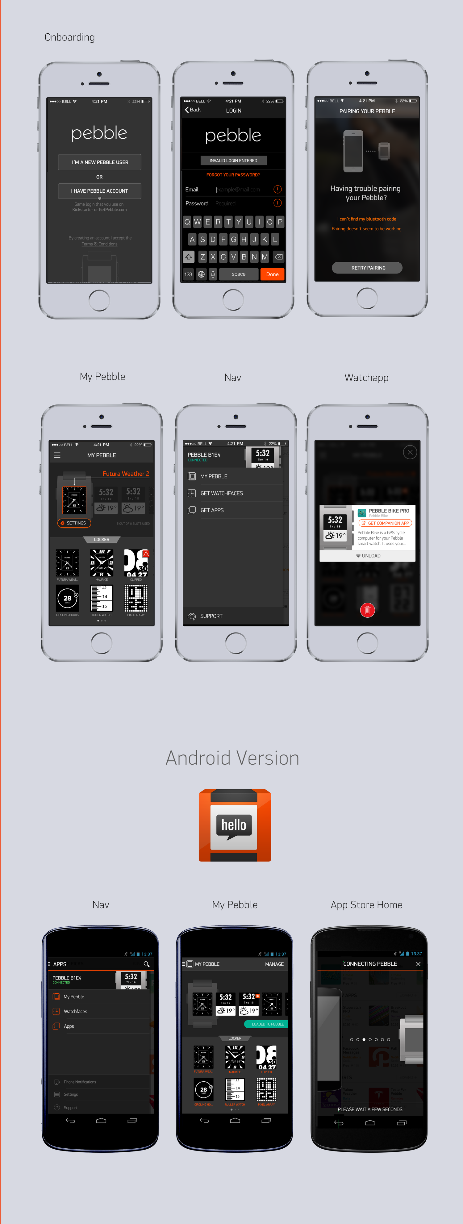
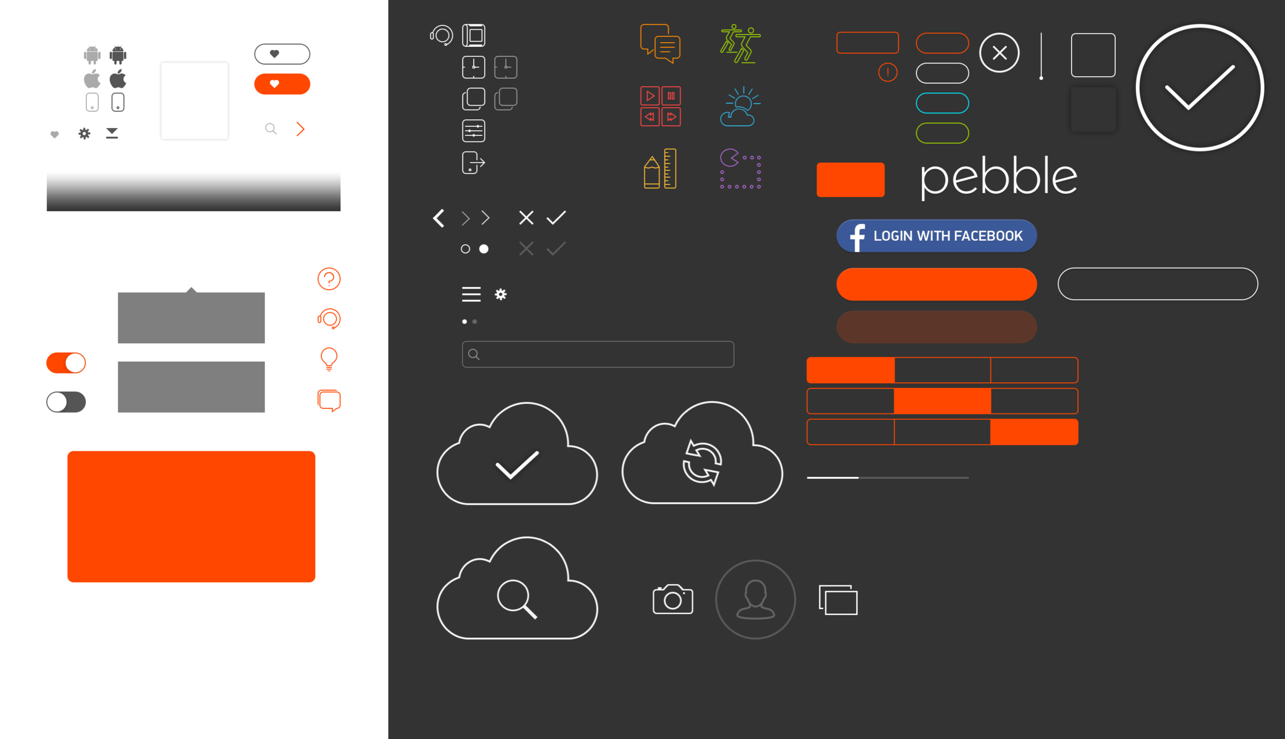
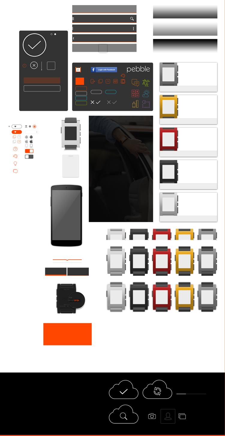
After the high-fidelity decisions were settled, we crafted a UI kit to carry them into development. It held the components, states and measurements engineers would otherwise have had to infer from a comp.
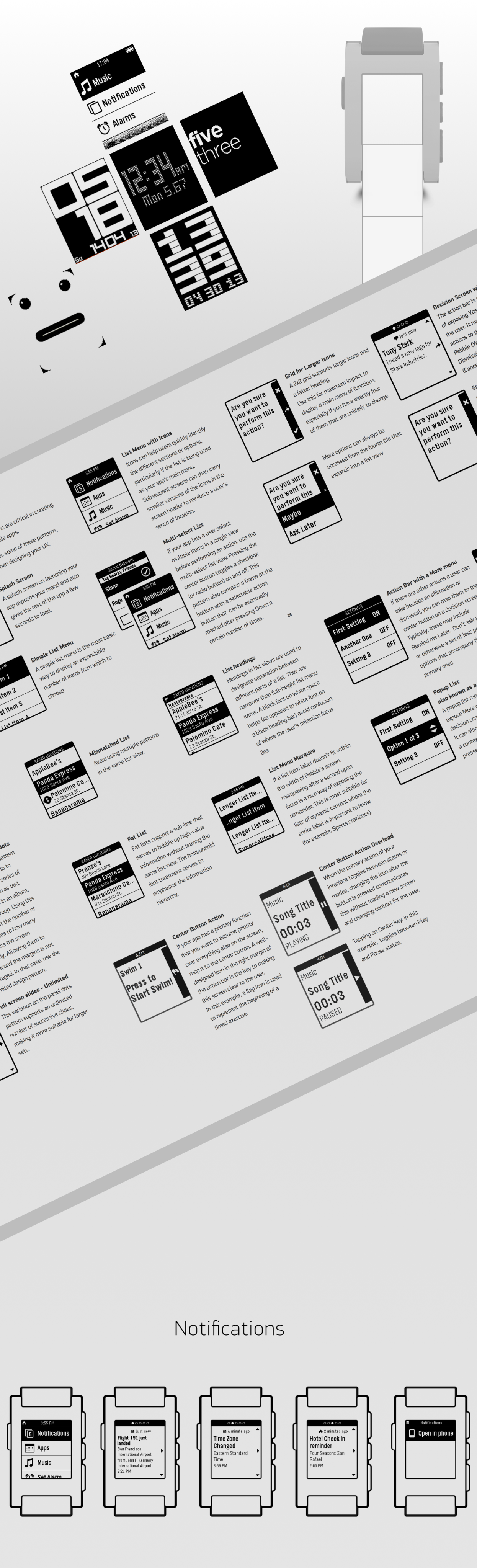
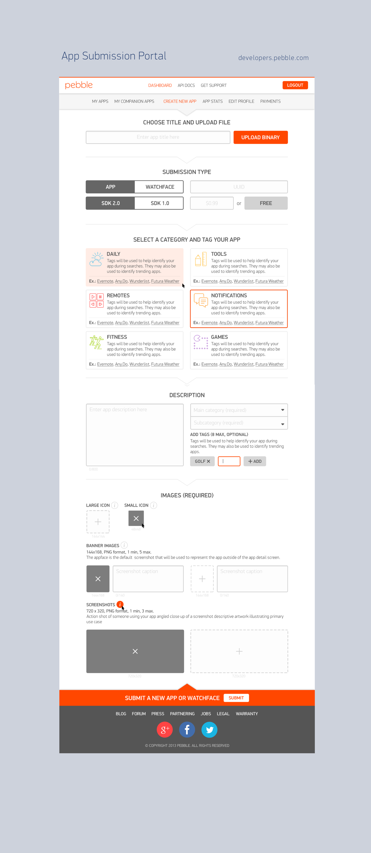
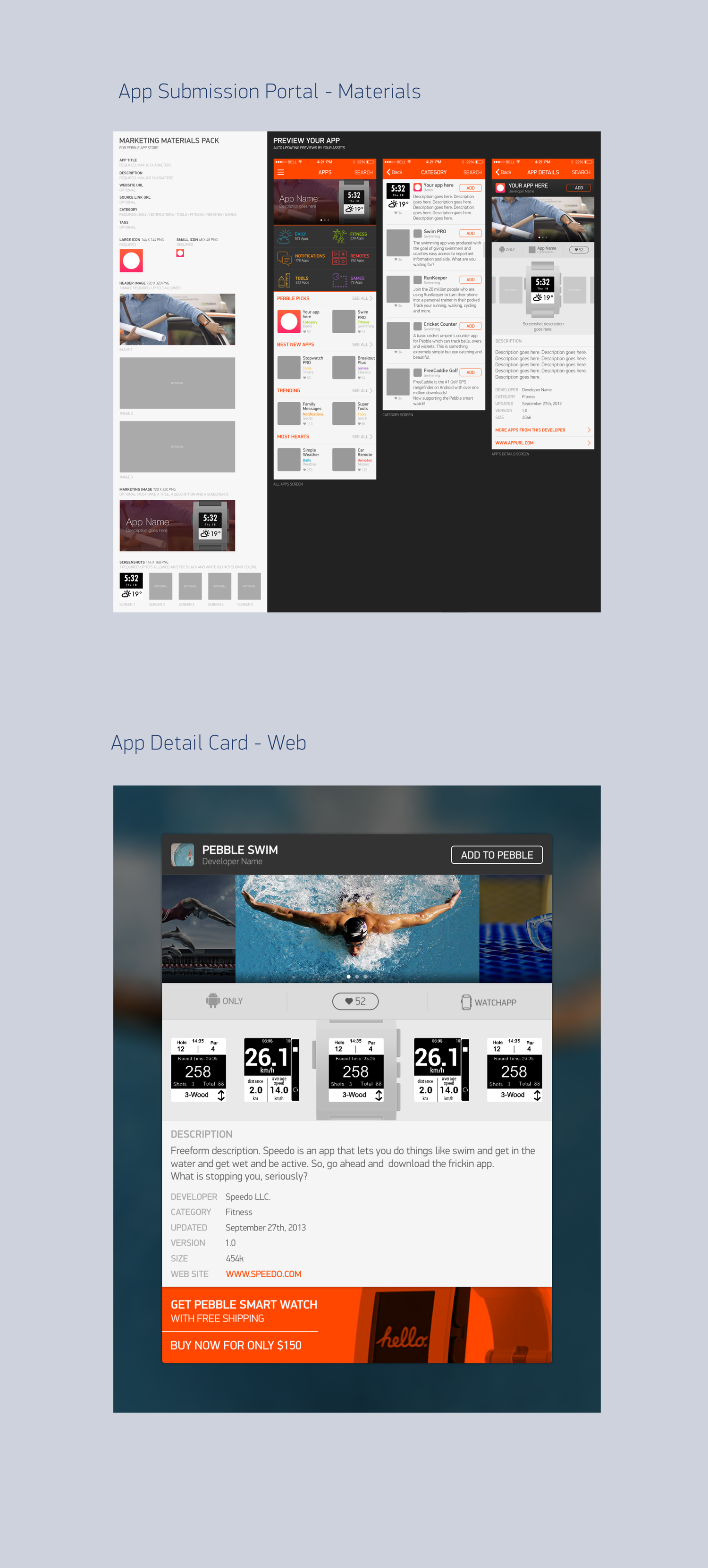
Developers needed a way to submit new apps, update them, track their approval states, and more. We also provided a UI template to help them visualize how and where their apps and related content would get displayed in our store.
Submission is the moment a developer finds out what the store expects of them. Every asset requirement is stated inline at the field that needs it: icon sizes, banner counts, screenshot dimensions, character limits. The preview shows the exact surfaces those assets land on.
Designing a platform means designing for people you'll never meet. The UI guidelines and the store template mattered as much as the app did. We also sat with partners like Uber and eBay to help them imagine what their own Pebble apps could be.