 Hightouch · 2021–2024
Patterns for data activation
I joined as founding designer on a product an engineer had built for engineers. I left it with a design system, an observability surface, and workflows a marketer could finish.
Hightouch worked. It was reverse ETL: data out of the warehouse and back into the tools business teams use every day. The front-end engineer who designed it had solved the hard integration problems for developers.
My job was to make it hold up as the audience widened. Data engineers first, then marketers, whose workflows were slow and unforgiving. That meant scaling patterns rather than adding screens.
The three principles we designed against.
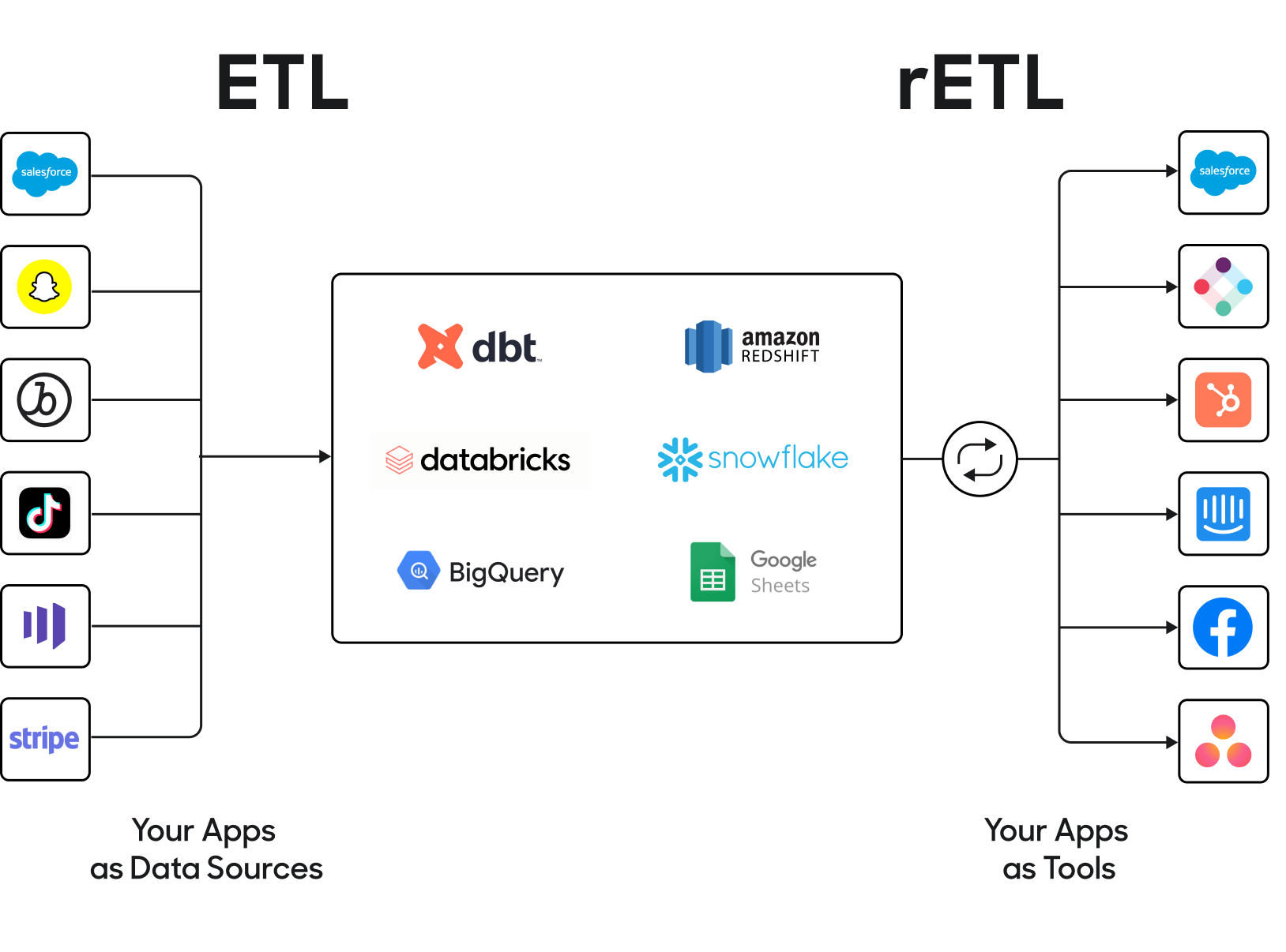
Where reverse ETL sits relative to a tool like Fivetran.
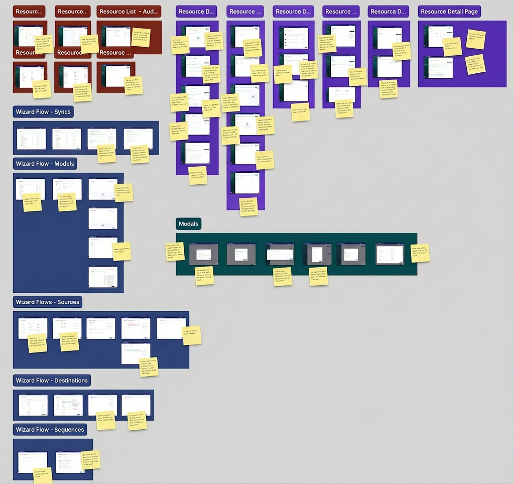
Spend the first weeks cataloguing debt, not shipping screens
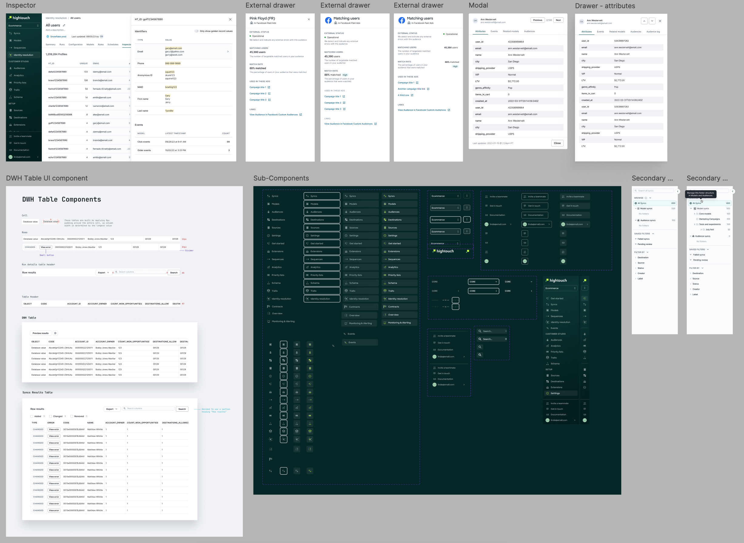
I walked every flow in the app against standard heuristics and wrote down what was actually wrong: color used inconsistently, a horizontal stepper stretched past the three steps it was good for, and a "Preview" query button sitting as a primary action next to "Save". Users stalled deciding which one came first.
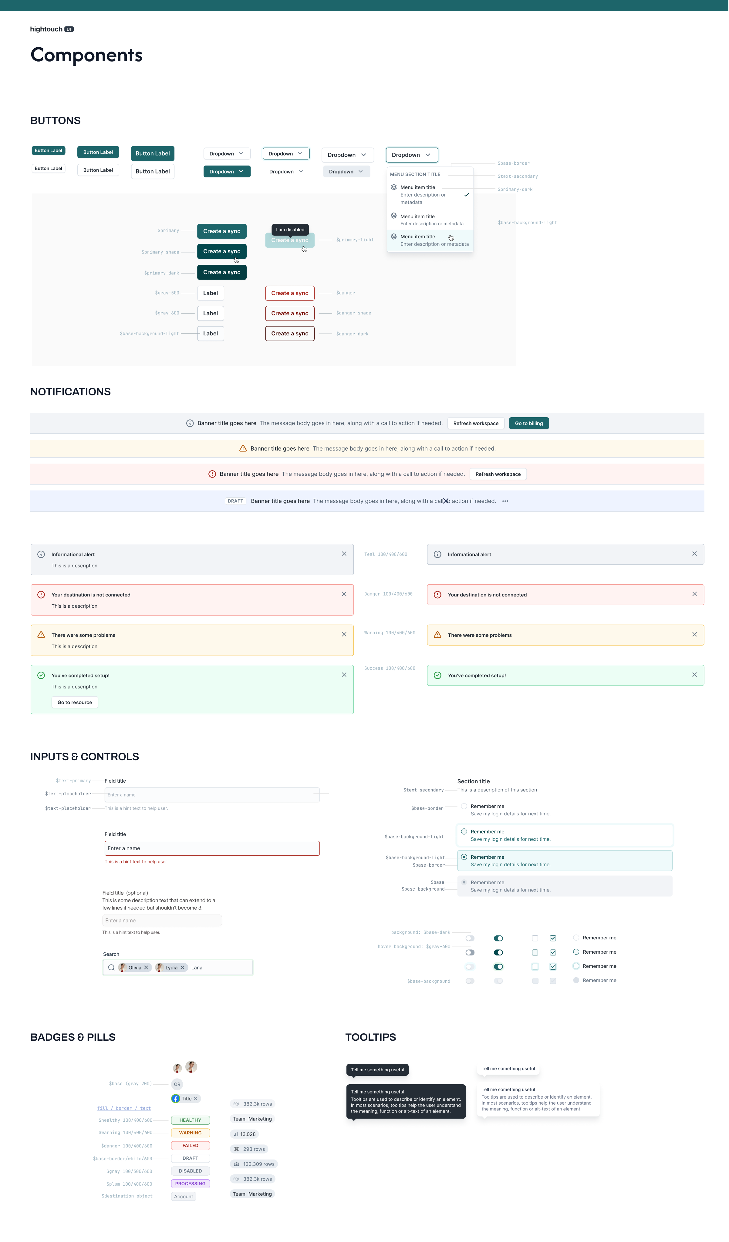
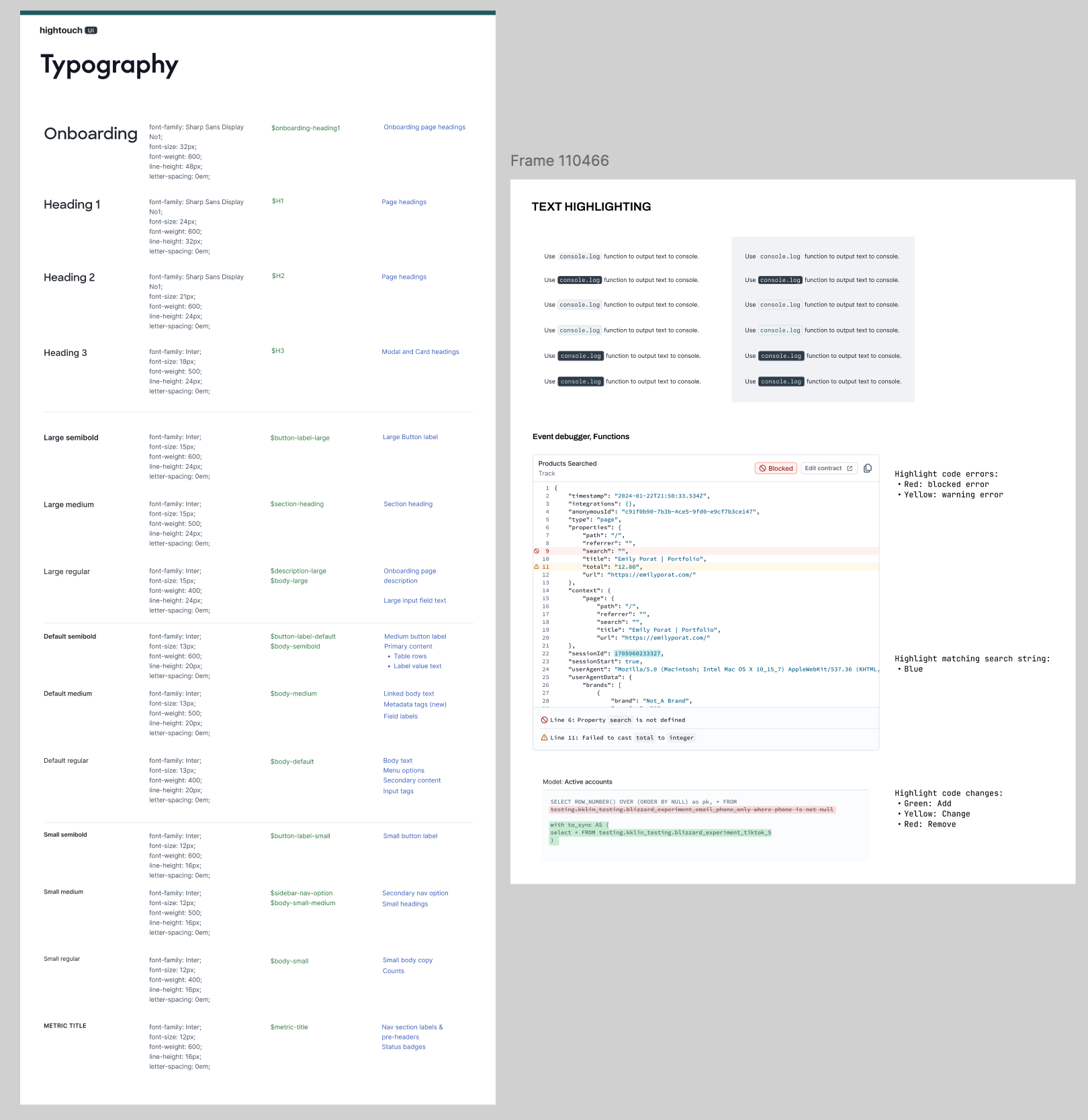
Cataloguing it was how I got the whole product into my head at once. After that I could fix things at the level of the system instead of one screen at a time. That is the only way one designer keeps up with a startup.
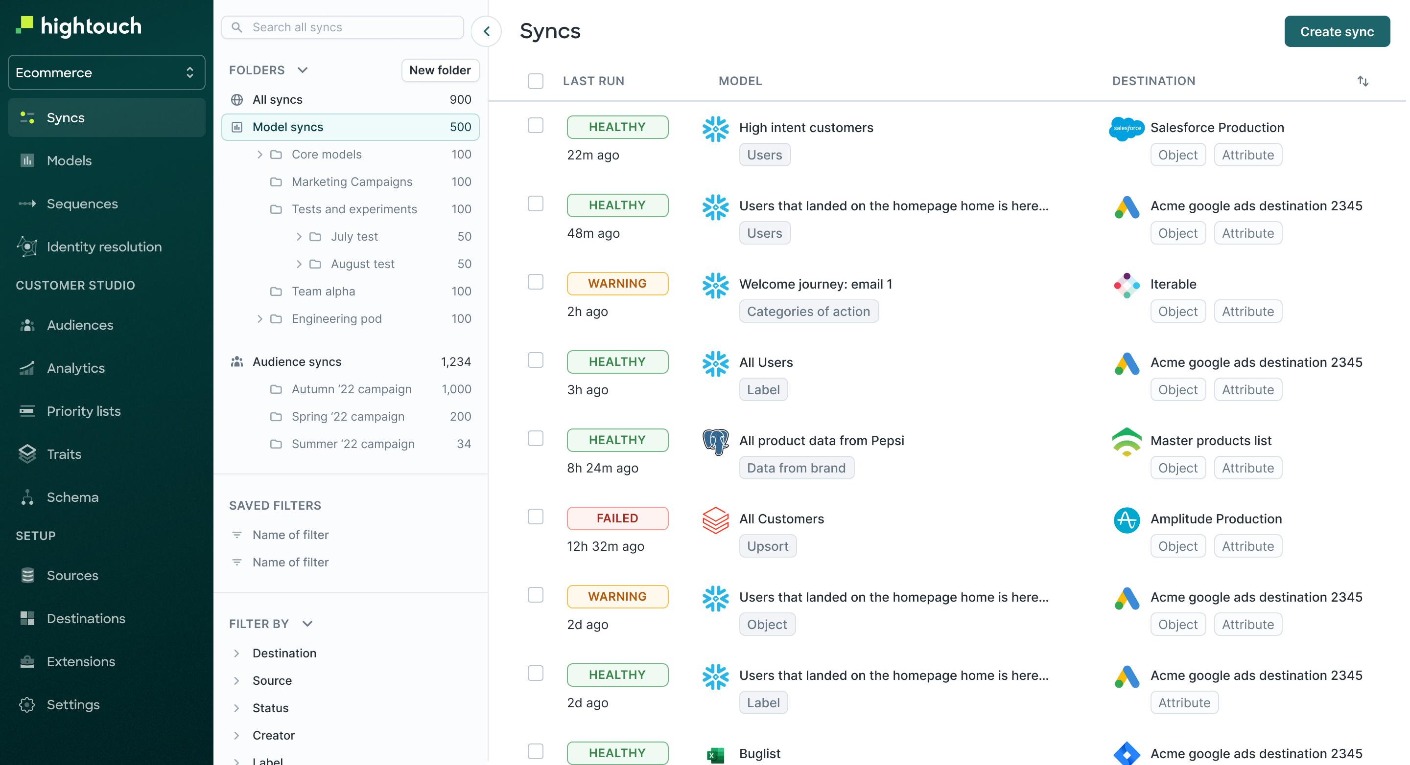
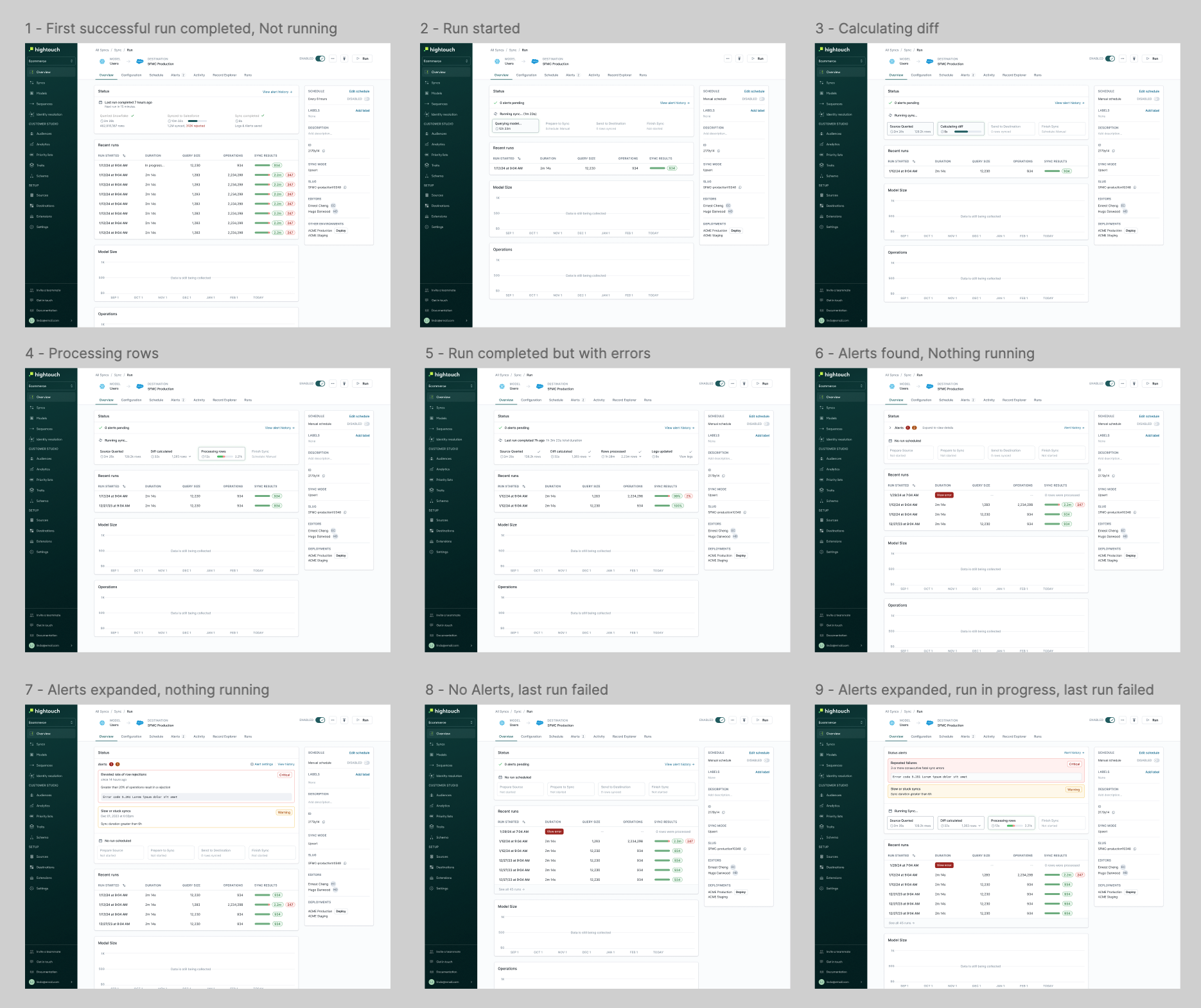
The home screen was a list of syncs. What users came to do was find the broken one.
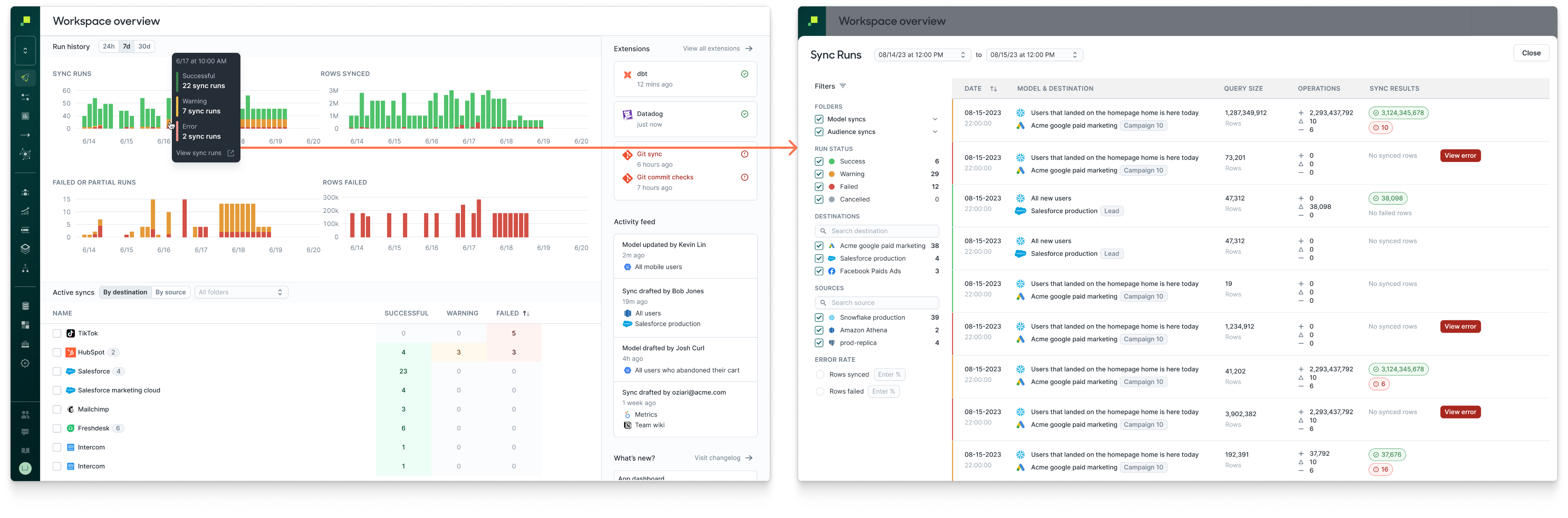
Customer interviews kept landing in the same place: too many clicks to reach error information, no sense of what needed attention, status badges that were hard to read, filters that were hard to build and harder to maintain, and no way to get the lay of the land. It all reduced to one job. Find recent errors and debug them fast.
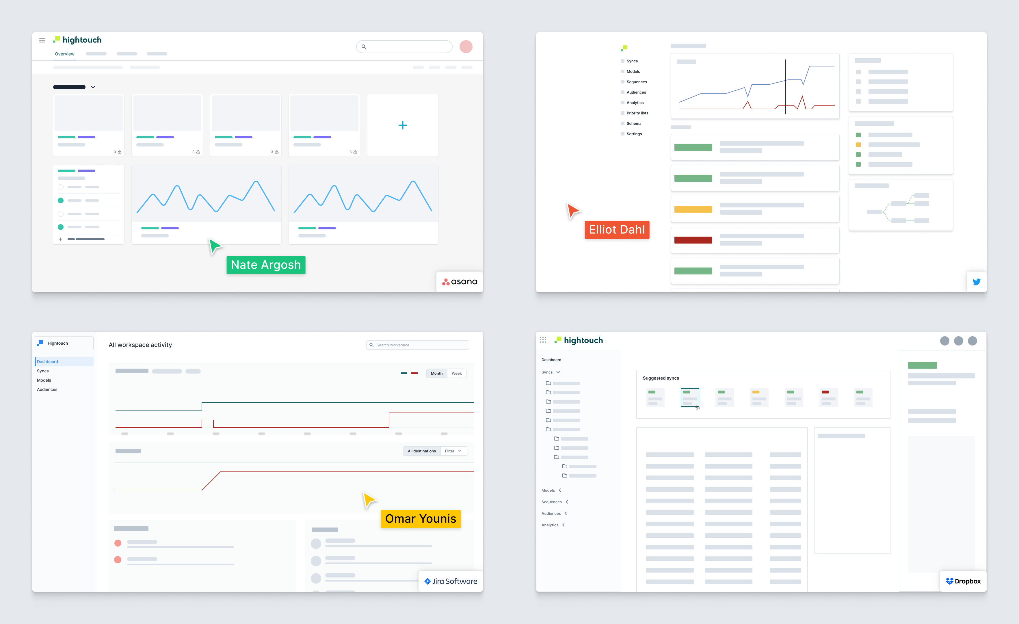
The existing landing page listed every active sync, and folders hadn't stopped it going noisy as usage scaled. I ran a design jam with the PM and founding engineer on what a monitoring-first home screen would show, prioritized the ideas against customer feedback, and shipped a dashboard where you land on a set of sync runs from a recent point in time across syncs and destinations. Nobody has to hunt for the failure.
Testing the value proposition, not the flow
Data activation is a straightforward promise. Clean, transformed data from the warehouse into hundreds of operational tools in minutes. We rebuilt onboarding partly to find out whether a business team would grasp that promise on first contact.
They didn't, and the confusion was specific: which sources should I connect, which destinations, and in what order. Asking people to assemble a pipeline before they had a use case in mind was the wrong opening move, which is what pushed us toward use-case oriented onboarding.
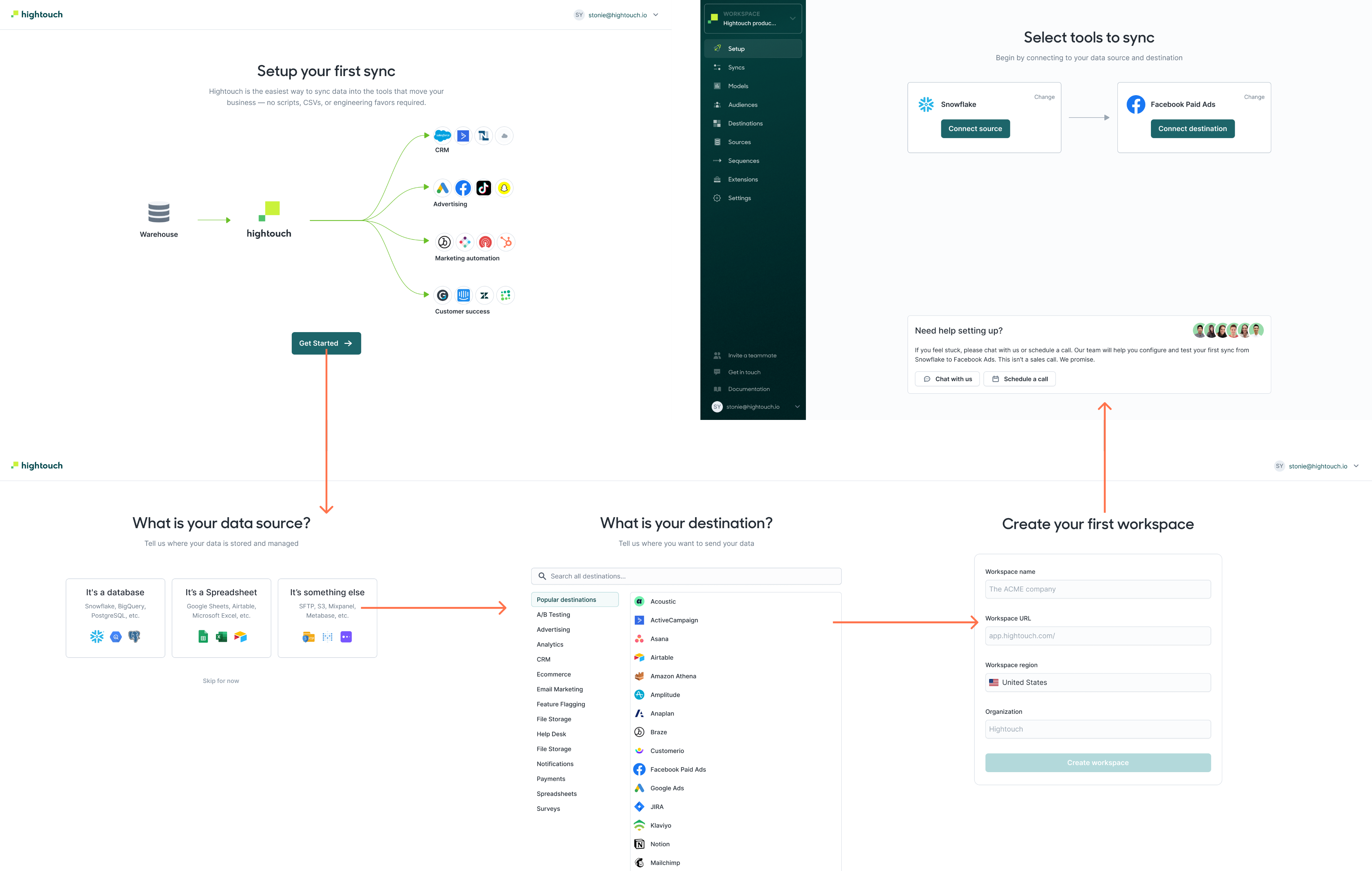
Users don't only monitor pipelines, they build them. Someone who stalls during setup often doesn't come back. Holding the long-range vision and the unglamorous step-by-step optimization at the same time was the real constraint of being the only designer.
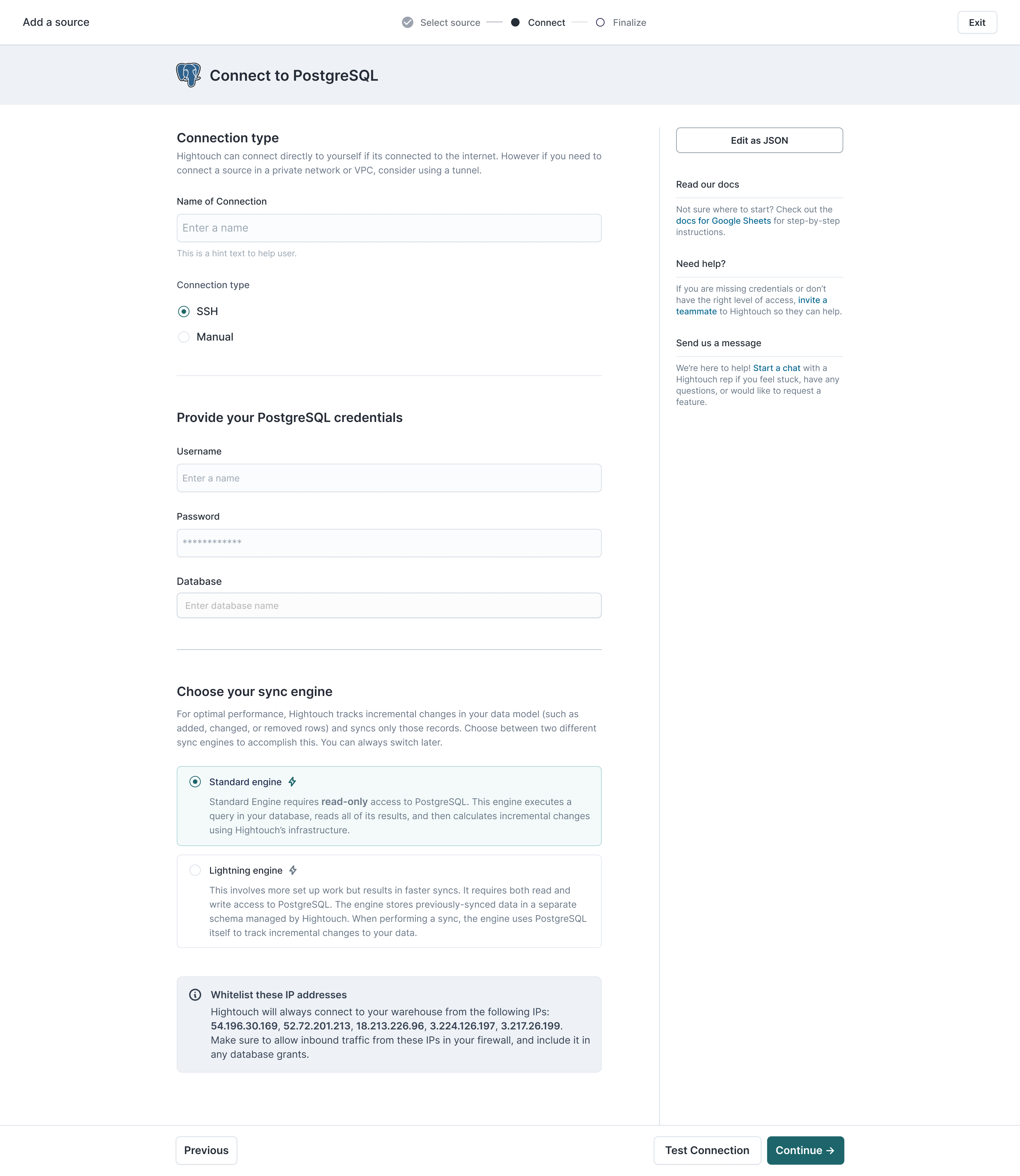
After the design debt in the core experience was under control, I moved to enterprise features first, RBAC and deployments. Then to marketer-facing ones, Journeys and the Audience builder.
Journeys is the clearest test of whether the foundation held. A canvas of triggers, destinations and delays is a different interface from a sync list, but it is built entirely from the standardized set: the same tables, drawers, status colors and empty states. A marketer reading a live journey and a data engineer reading a failed sync are reading the same language.
Journey overview: canvas and per-tile performance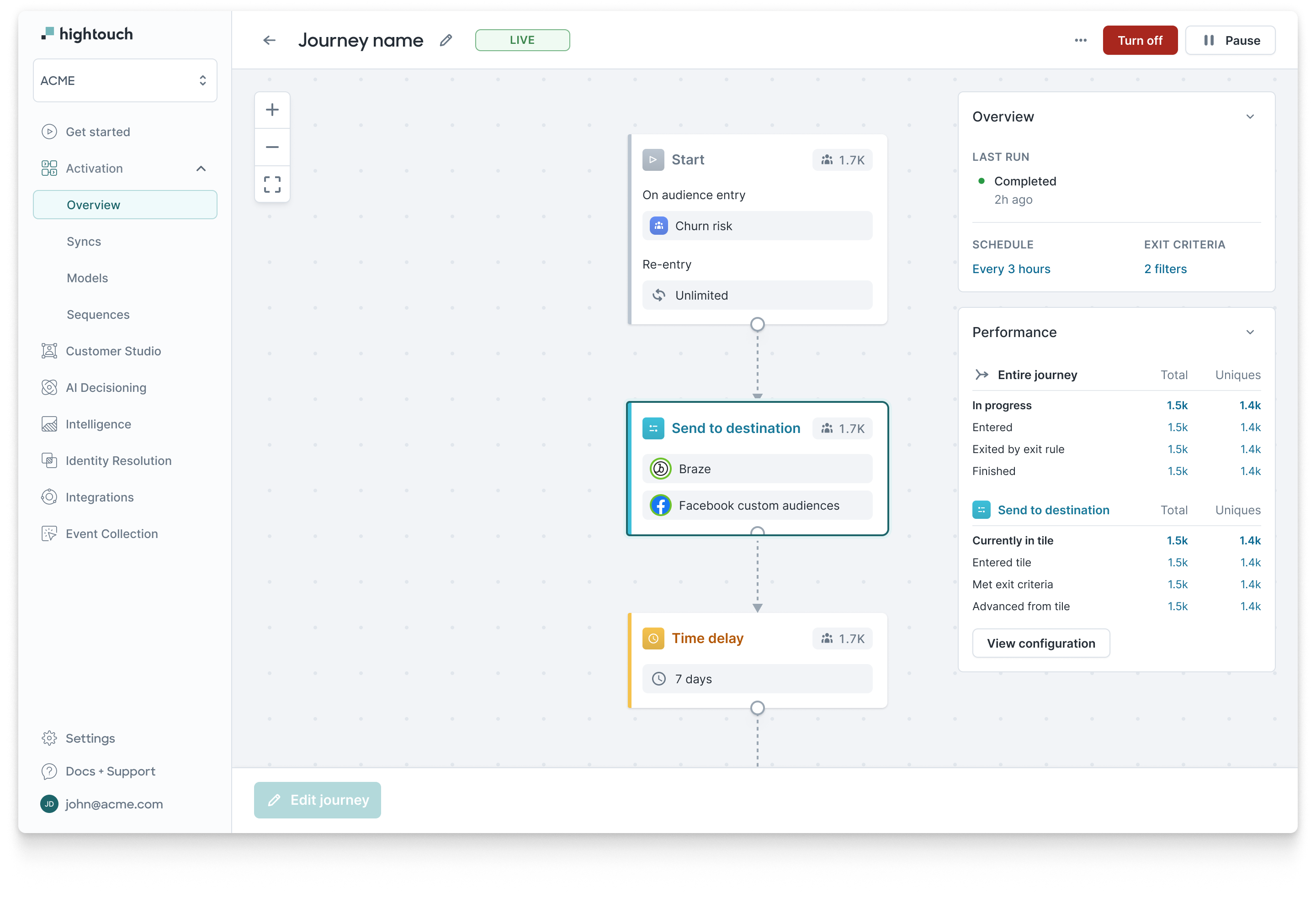
Teams serving data engineers don't buy from self-serve alone. They read the docs, watch the explainer, sit through the demo, and come back to the product once their questions are answered.
So the product's job is narrower than it looks: be as simple as possible, put guardrails and governance where the risk is, and always leave a visible path to help. Designing for that reality beat designing for a frictionless self-serve fantasy.