Background
Fivetran is a leader in the data integration and automation market. Customers of Fivetran save time and money by using our software to set up and maintain data pipelines. Rather than hire a team of data engineers, companies use Fivetran to select data sources and destinations from which to extract and load data. Data is then automatically synced at regular intervals so analysts within our customer orgs have fresh, reliable data for use in their analysis.
My Role
The first version of the app had been designed and built by Fivetran without
a design team in place. As the first design lead, I was tasked with redesigning
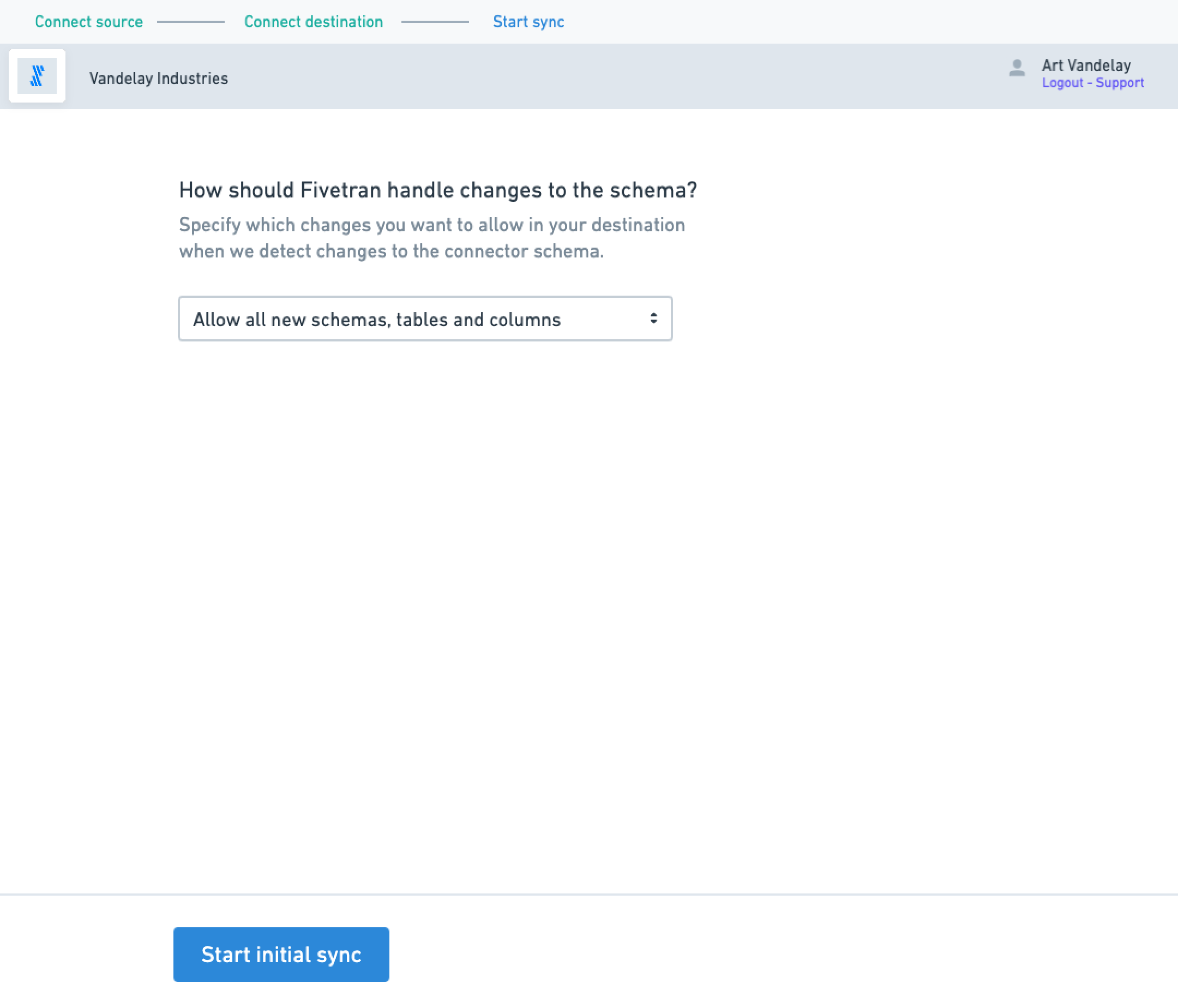
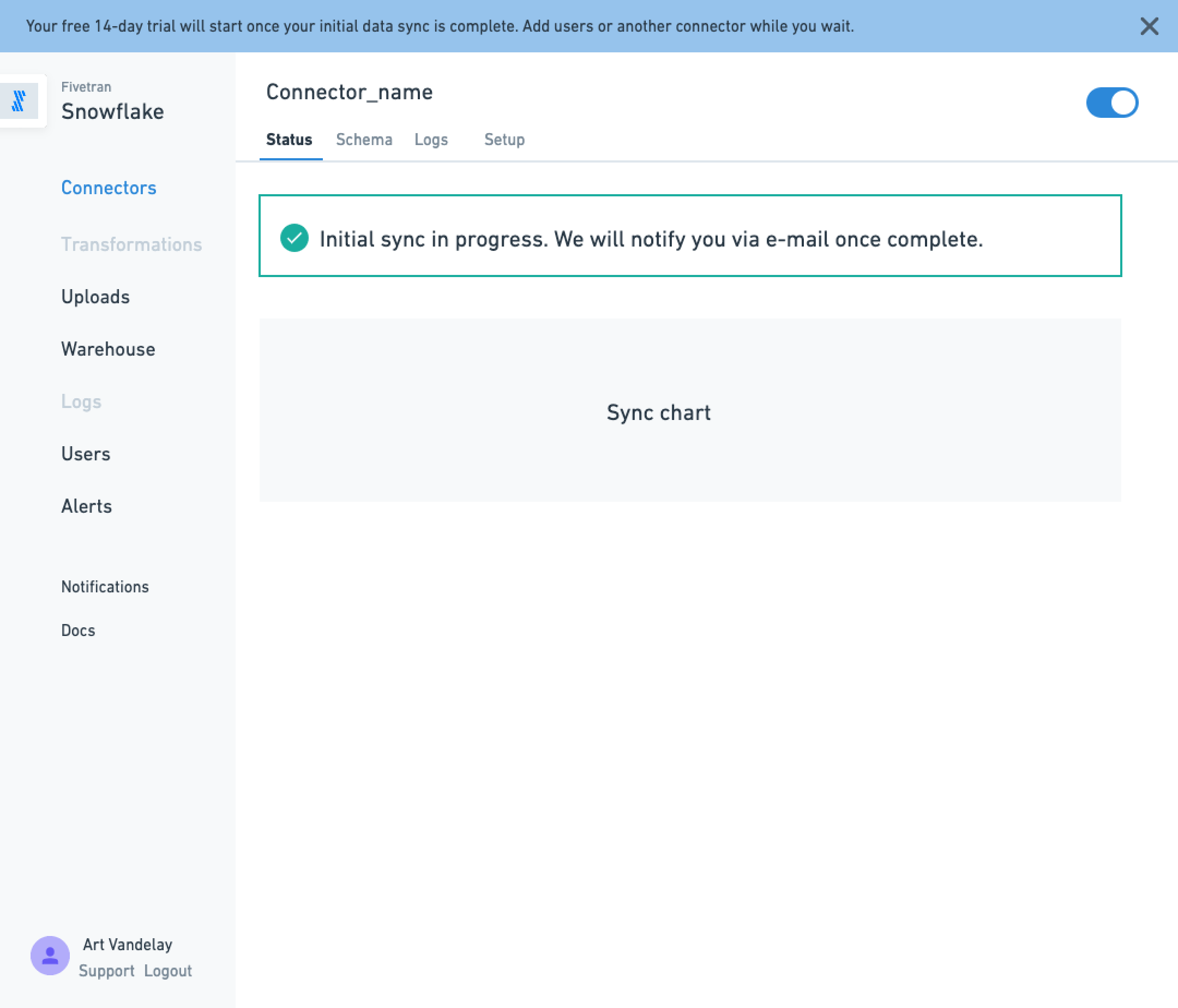
the entire dashboard UX. Here’s some screenshots of the original app:
Primary Research
I held a series of customer interviews with our key personas which helped me understand our target users.
This was a first draft that reflects the SMB segment. Personas evolved and expanded over time as we are moving into the Enterprise markets and organizations are more complex.
Prioritization
I worked with PM and ENG to get some initial plans and priorities in place.
First we needed to improve onboarding dropoff rates, which were
significant (over 56% of prospects entering the flow would not complete
the initial data sync). We started with fixing some low-hanging fruit with our existing onboarding workflow:
The blue text represents improvements the PM and I validated and could make in the near term. We implemented some of these right which helped reduce dropoff at key steps in the flow.
Iterations later…
I then worked with multiple PMs and our core front-end ENG team to capture a future state 2 quarters ahead of time, budgeting time for UX validation and testing. We examined tradeoffs, workflow design and UX copy in Lo-Fidelity, starting with a revised onboarding flow that accounts for new requirements and features, such as “universal column blocking and hashing” which lets customers block or hash (encrypt) their data before it reaches the destination, regardless of the source type (we only had it working for a subset of marketing data sources). The process involves:
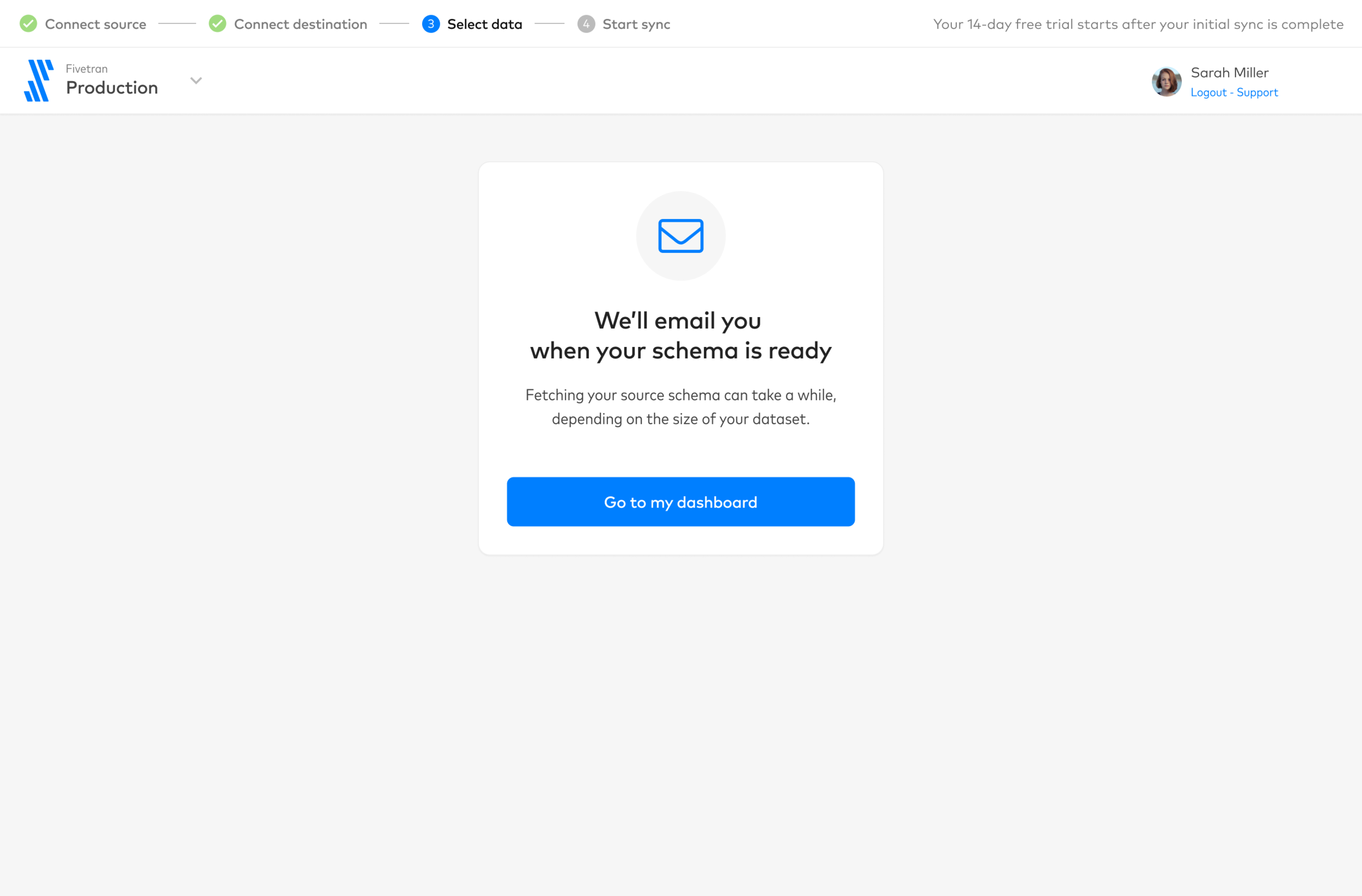
Progress state where Fivetran fetches the source schema… (it can take a while)
Presenting it to the user for review, and to choose which tables/columns to block/hash
Account for cases where the schema is too large and the user is forced to wait
More steps, more logical pathways
Lo-Fidelity
We evaluated UI tradeoffs and UX copy in Lo-Fidelity
Visual & UI Design
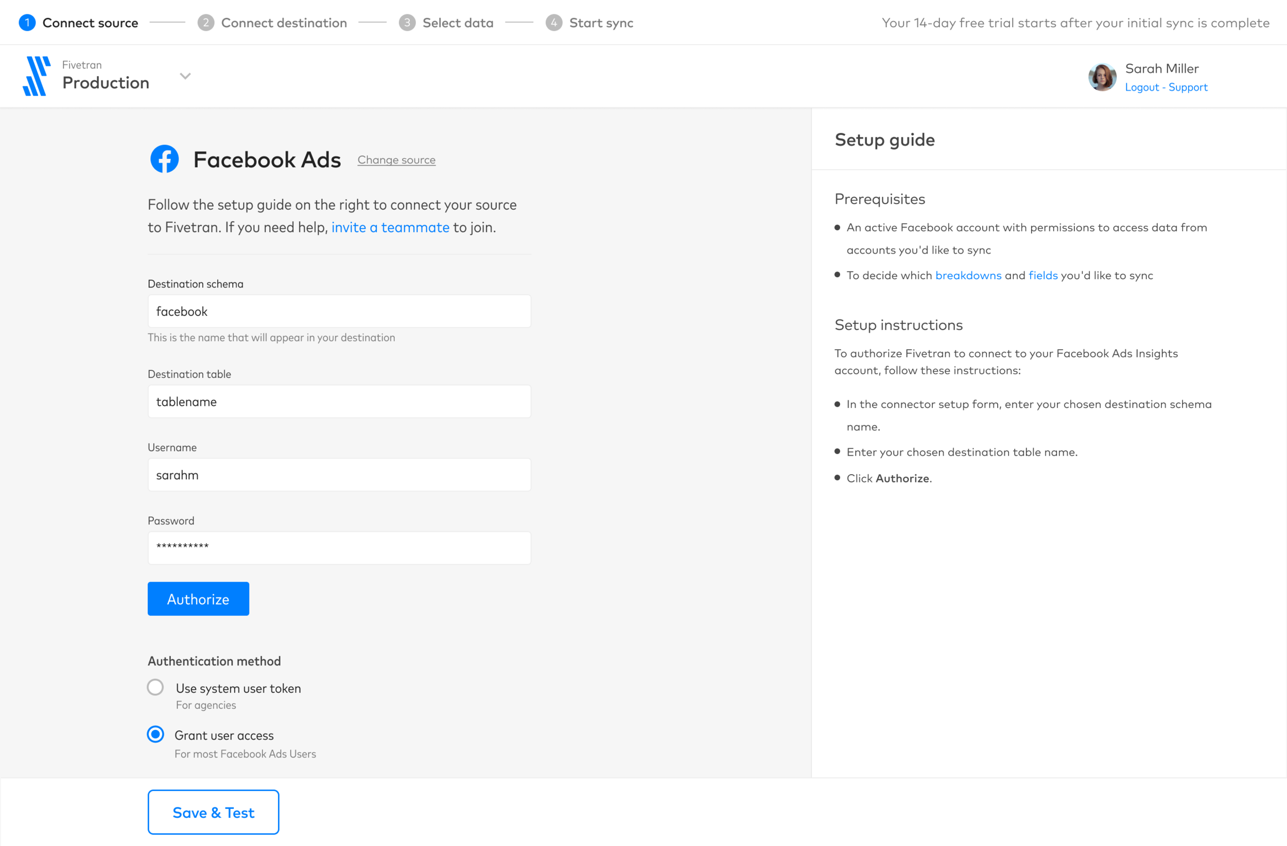
I began to invent the visual language and introduced a 1.0 of our design system. Here are some artifacts from onboarding, the first part of the user journey.
Component inventory from Onboarding


