exabeam.jpg

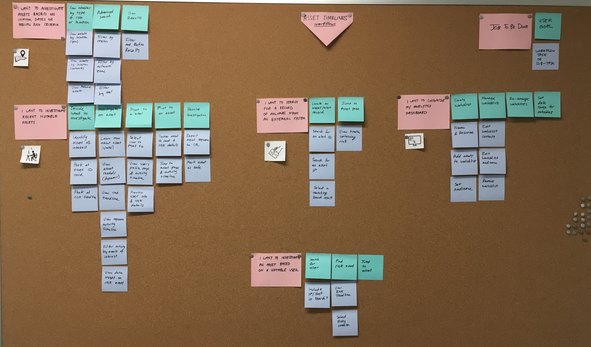
Exabeam is a cyber security platform designed for teams of security analysts or "SOCs." Each component of the platform had integration points with the others, and each were in various states of maturity. Some contained functional feature gaps, others had UI/UX inconsistencies and usability pain points. The design team began introducing a scalable pattern library and platform-wide user journey maps to address that and more. Our goal was to achieve a design system that was consistent across products & flows, and could be extended in accordance with our established design principles.


Design Process

There were dozens of workflows to design and build. By using a process that divides the work into phases, we were able to correctly define the problem, decide on a direction and gain stakeholder approval before mocking up ideas and doing detailed visuals. This helped us meet to expectations and avoid mis-executing. 

process.png


Page Redesigns

A lot of the product underwent page-level redesigns. We needed to refresh the visual design, as well as introduce new functional capabilities. We identified pain points in the original design then worked through low and high-fidelity iterations until both UX & Visual details were finalized.

We needed to achieve visual consistency in our designs between the old and new pages. This was particularly challenging when redesigning the chart UI/UX, since the interaction stories could be complex.

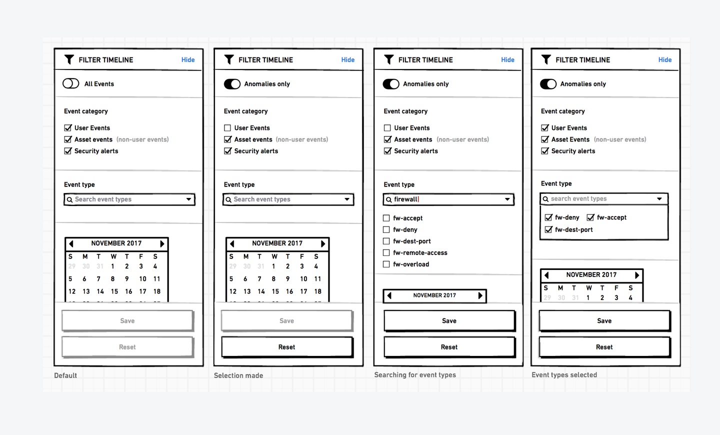
We worked on reskinning this timeline page as well. All the pieces of the design system were redesigned, including components like the filter panel below.

From stories to detailed UI components

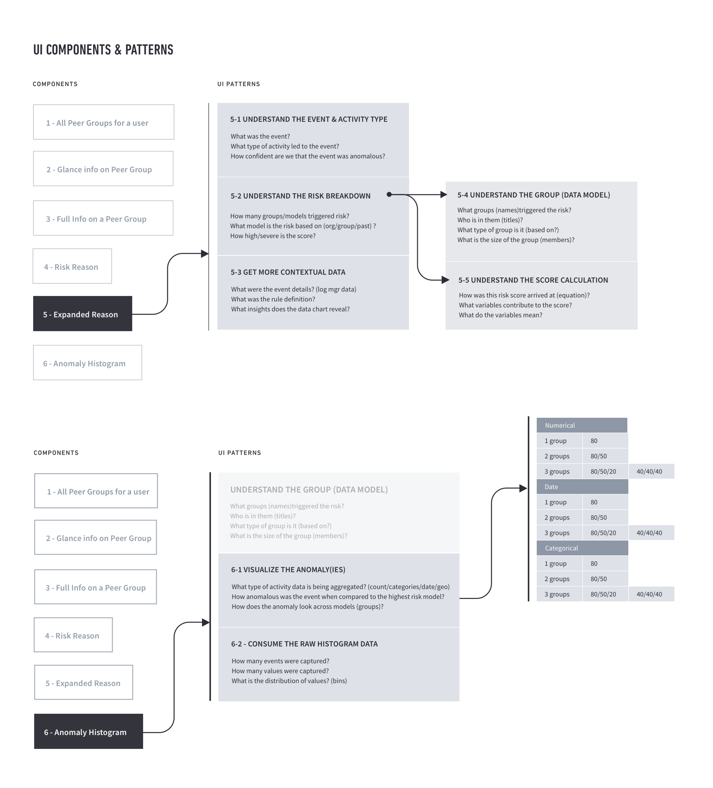
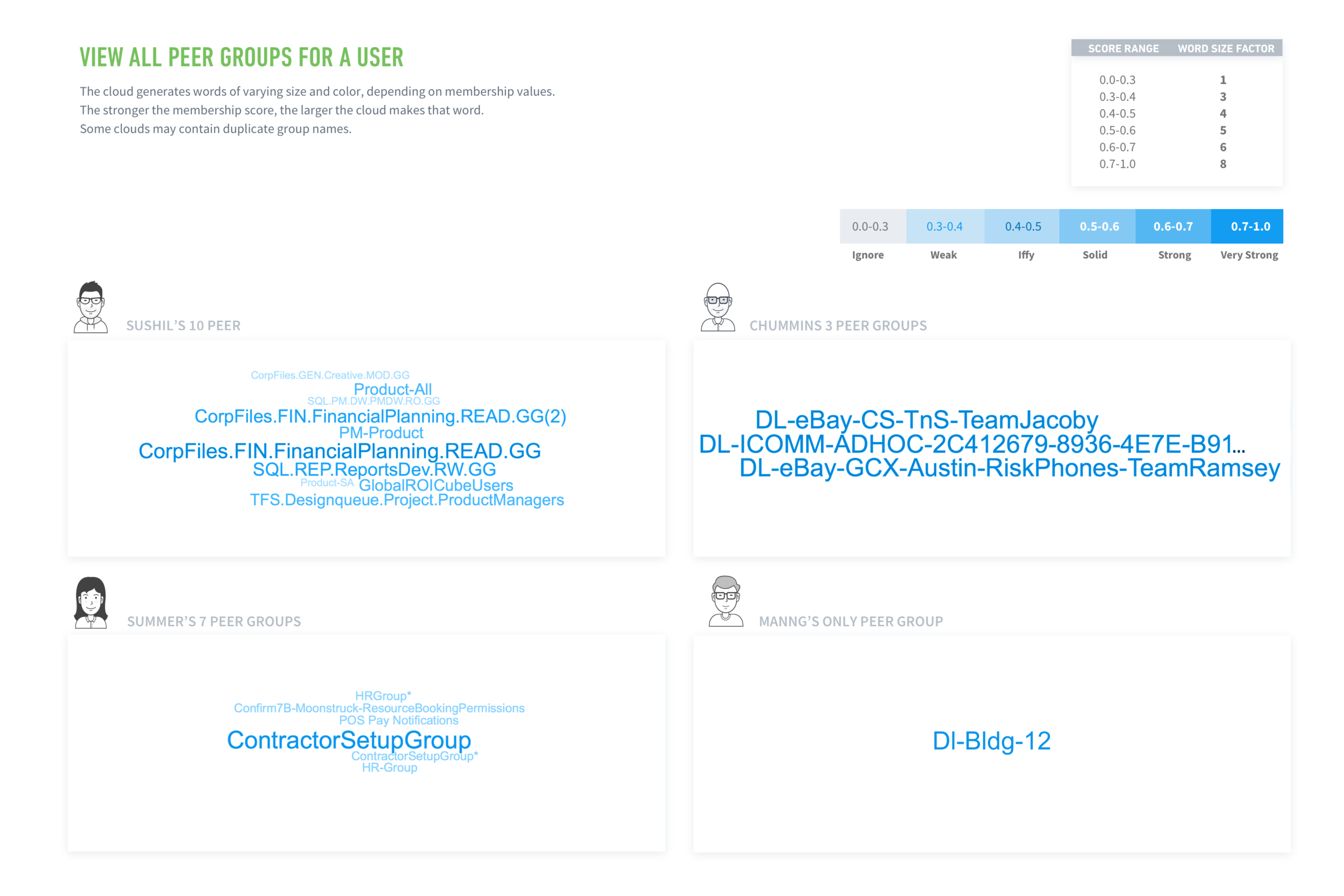
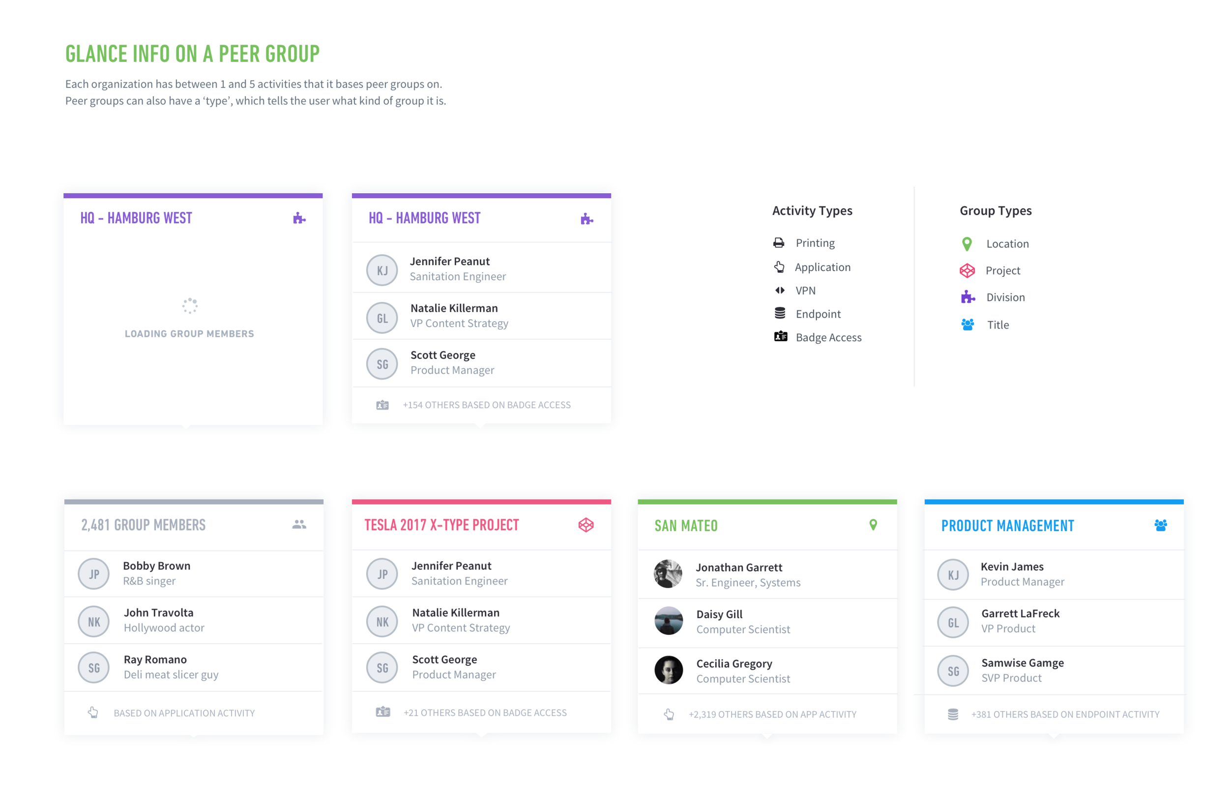
Some PM requirements were purely functional descriptions of what the interface should do, without context around the user's goals. For investigative workflow, this often involves lots of layers of information that the user wants to access in a certain order, and hierarchy. To realize the appropriate UI designs, we dug deep into user needs and identified what data our UI would need to support, and answer questions as to how the UI would adapt and scale across varying data sets and customers.

UI systems

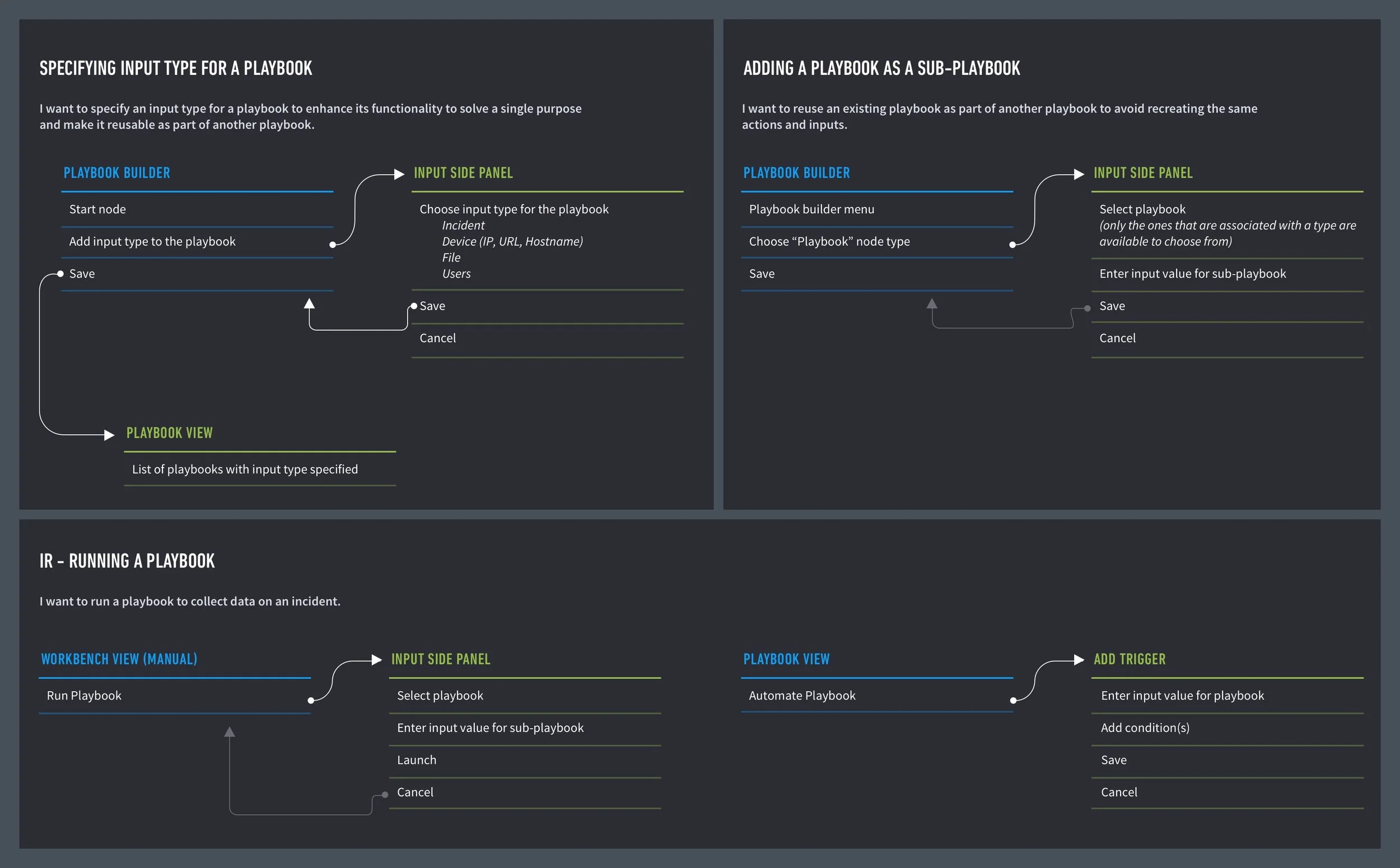
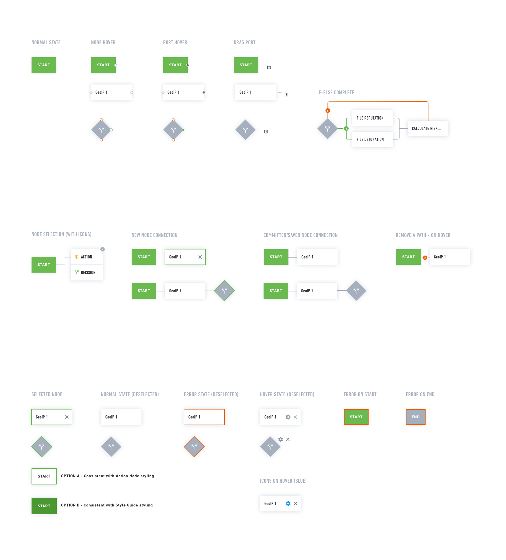
Our incident responder product needed a "builder" interface that allows users to build a logic-driven playbook to support the product's automation features, reducing the amount of time users would have to spend remediating incident reports (phishing, malware, etc.) manually.

The solution was a UI system that our developers could use to customize the visual framework they were building on top of.

custom-component-system.png

Testing & Validating UI

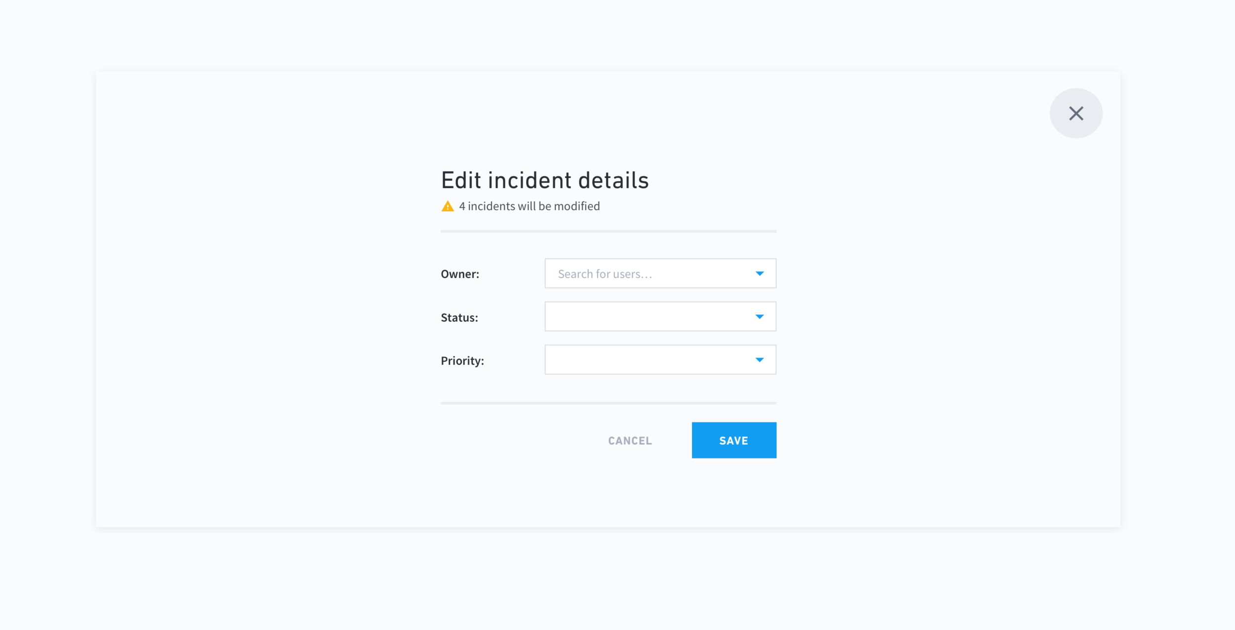
Sometimes we could not decide which direction to take when creating a new UI component that we knew we would need to reuse. To help pick a direction, we sometimes created a set of options and showed them to customers to see if there were any obvious winners.

Data Visualization

Below are line charts. We also worked on our favorite versions of other types of visualizations, and ruled out the ones that contained inherent limitations. Things we considered deeply were color systems, how to label axises, legends, tooltips, and varying levels of zoom when looking at data over time.

visualizations.png

Style Guide & Component Library

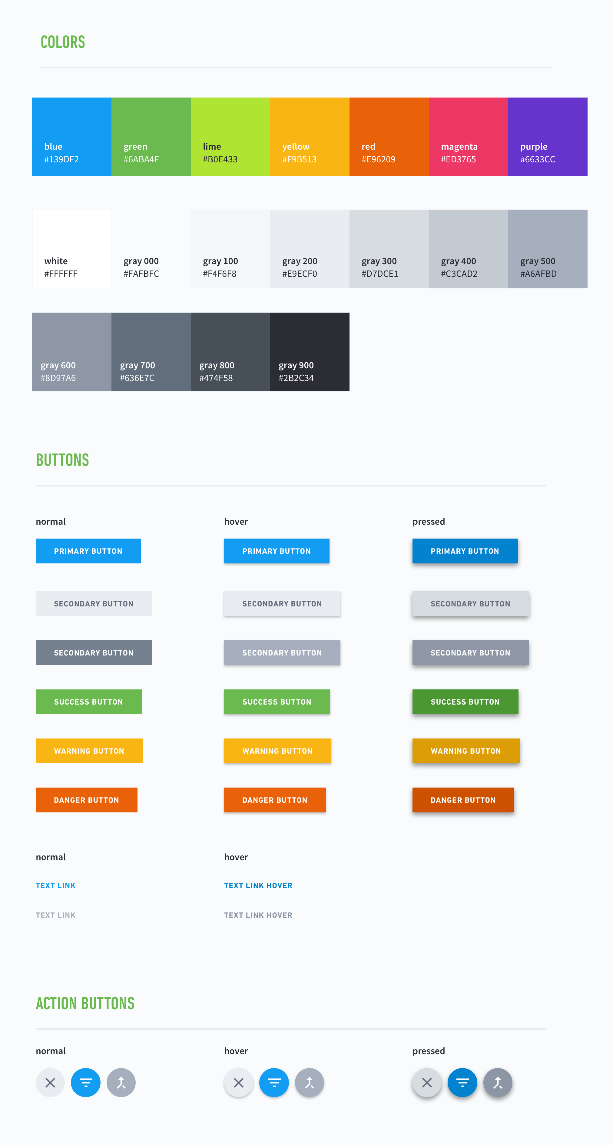
We created master style guides and searchable libraries of common UI components so the design team could put high-fidelity mockups together quickly whilst maintaining consistency across products and features.

Style Guide – Colors.png
Style Guide – Colors Copy.png